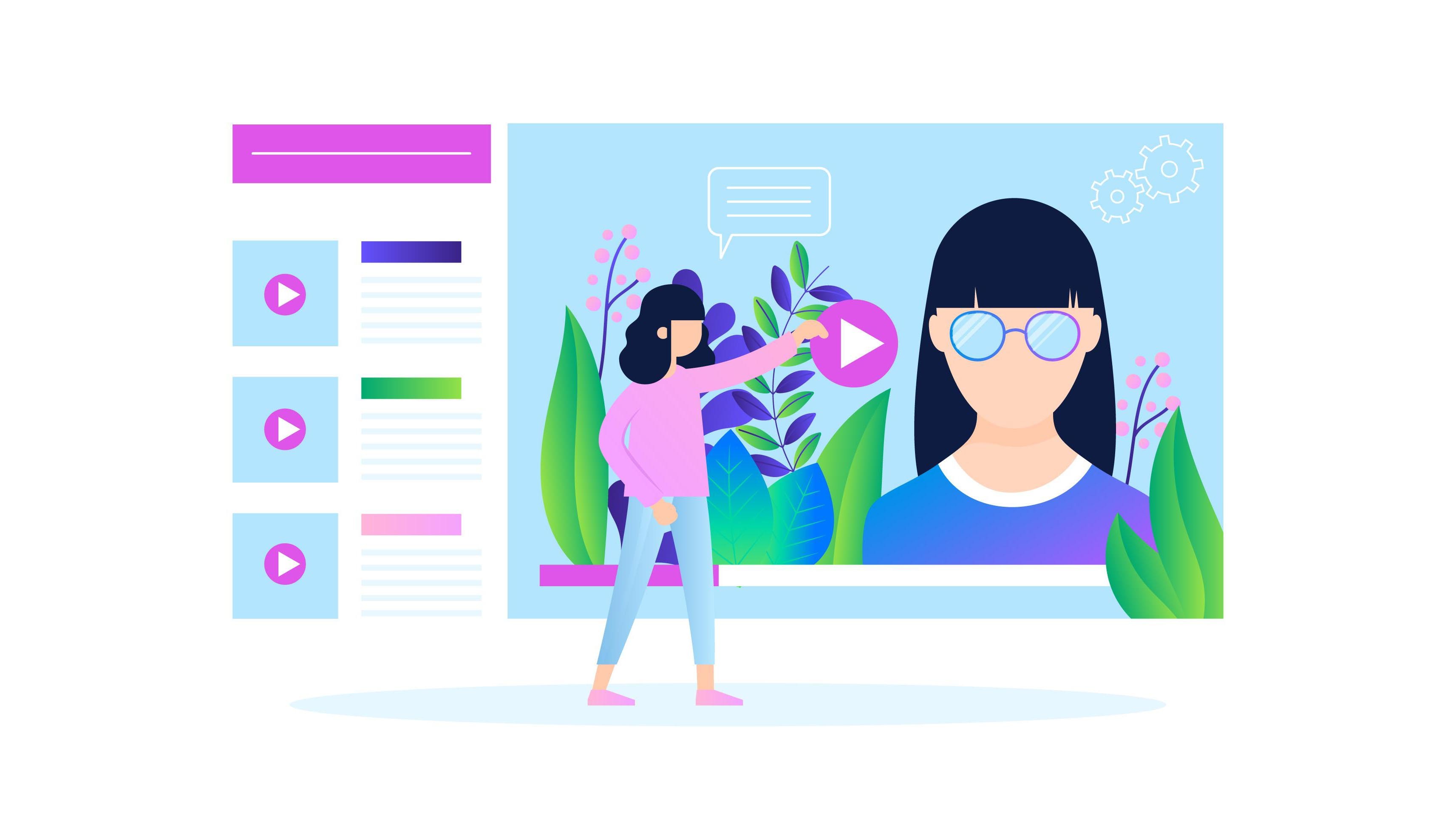
Why UX Animation Matters for Engagement and Conversion
Mar 26, 2025
A button that just changes color? That’s fine.
But a button that gently “breathes” on hover, gives a soft jiggle, then opens a form with a smooth slide?
That’s memorable.
Suddenly your site feels alive.
Today we’re breaking down why UX animation isn’t about decoration — it’s about guiding, engaging, and converting.
The (Very Common) Problem
Most business websites — especially in B2B or service sectors — fall into one trap: they’re too static.
Users scroll, click, leave. Nothing pulls them in emotionally. No sense of flow, rhythm, or interactivity.
But your site isn’t a digital flyer. It’s a space where you can lead, delight, and persuade.
That’s where UX animation comes in.
What Is UX Animation — And Why It Works
UX animation means intentional micro-movements and transitions that:
Guide attention (highlight key actions or steps),
Create feedback loops (e.g. button animations = “yes, that worked”),
Support brand identity (a fluid luxury slide vs. a snappy, playful bounce),
Boost conversions (yep, studies show smooth transitions increase user satisfaction and actions).
Practical Examples That Work
Buttons with personality
A button that reacts to your hover feels intuitive and alive.Creative loading states
Replace the boring spinner with a branded motion — makes waiting more pleasant.Smooth content transitions
Instead of harsh cut-ins, content gracefully appears, keeping context and flow.Hover effects on product cards
A slight lift or glow on hover creates curiosity — users want to click.
Where People Go Wrong
❌ Over-animated sites that feel like a theme park
❌ Slow animations that kill momentum
❌ Pretty motions with no functional purpose
❌ Inconsistent motion styles — one thing floats, another jerks
💡 The best UX animation is almost invisible — but without it, your site feels flat and cold.
Case Study: AI Landing Page
We helped a startup launching an AI-powered automation platform. Their original site was clean, but… dead.
We introduced micro-interactions: expanding blocks, responsive CTAs, subtle icon movements.
Nothing flashy — just thoughtful motion.
📊 The result? Bounce rate dropped by 17%, and average session time went up by nearly a full minute.
Why? Because users felt like the site was reacting to them.
Final Thoughts
UX animation isn’t “fluff.” It’s a functional layer that makes your website more intuitive, more memorable, and more effective.
👉 If your site feels like a static slideshow — bring it to life.
Motion builds trust, keeps people engaged, and turns visitors into action-takers.
Our team at One Line can help craft UX animations that aren’t just pretty — they perform.
